My client, Reboot & Recover, provides resources and a professional help hotline for people struggling with screen addiction.
— PROJECT NAME
Reboot & Recover website overhaul
— WHAT MY TEAM DID
UX research
UX writing
Brand voice / content style guide
Figma wireframes
— TOOLS
Figma
Google Suite (Docs, Slides, Forms)
Whimsical
— DATE
April – October 2020
Reboot & Recover, a non-profit organization, provides resources and a support hotline for people struggling with screen addiction. It also depends 100% on public donations to keep running.
CHALLENGE: Its original website suffered from low user engagement due to having too much jargon and a confusing design layout.
SOLUTION: I collaborated with an international team of 10+ UX designers and writers to conduct UX research on addiction, develop a new brand voice that advocates for empathetic-sounding copy, and redesign the website with renewed information architecture.
PAIN POINTS
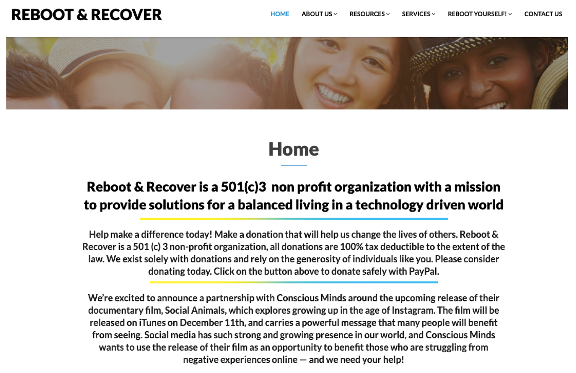
The client's original website had too much copy and lacked clear information architecture, especially on its homepage (below) which can cause cognitive load and deter a visitor from exploring more.
Also, on its top menu, the "Resources" and "Services" links sound synonymous, and users would not immediately understand what "Reboot Yourself!" means — which can cause more confusion. This all helped explain why the website had minimal traffic engagement.
The work.
SUBJECT-MATTER EXPERT INTERVIEWS
To conduct UX research, a teammate and I interviewed Reboot & Recover’s founder and 3 licensed health professionals to learn more about screen addiction and their pain points with the website thus far.
We asked questions like how they each define the term “screen addiction” and what demographic is more likely to seek professional help for it.
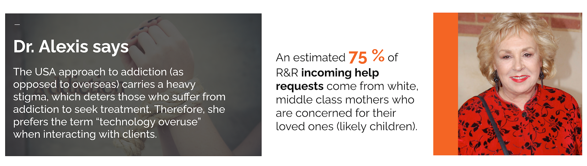
We gained insights on how American society associates addiction with a negative stigma, and how most visitors to the client's website are concerned loved ones.
REFRAMING OUR ASSUMPTIONS
We shared our findings in a presentation, including how most Americans don't understand screen addiction and its severity. This showcased the importance of UX research which combats pre-conceived assumptions.
A key finding was that a loved one (i.e.: parent, sibling) of a person struggling with screen addiction is more likely to seek professional help on their behalf.
Our UX research presentation was a valuable resource that influenced our team’s UX writing process later.
FROM DATA COMES USER PERSONA
The client's founder shared data analytics that showed:
- The website received minimal engagement — just 426 views and 6 customer calls in April 2020; and 125 views and 3 calls in May.
- Website traffic and hotline calls mainly came from concerned mothers (aged 30 to 50) who were seeking help on their child’s behalf.
Our UX research helped my teammate develop 2 new user personas. The main user persona (below) focuses on a concerned middle-aged mother of a son who's struggling with screen addiction.
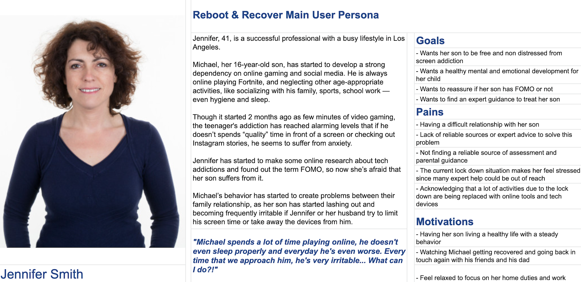
Meet Jennifer: A concerned 41-year-old mother with a child struggling with screen addiction.
DEVELOPING THE CONTENT STYLE GUIDE
Our research found that screen addiction carries a negative stigma and is a very sensitive topic for people who can feel shame and judged for having it.
Also because most of the website’s traffic are concerned loved ones, this helped our teammate create a new content style guide that advocates for empathetic-sounding copy:
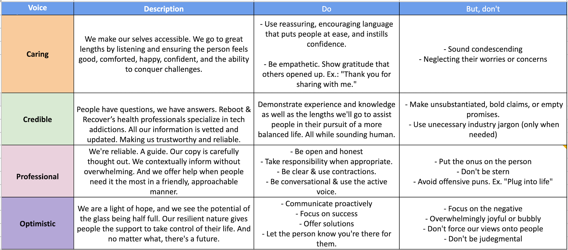
ENGAGING / EMPATHETIC COPY
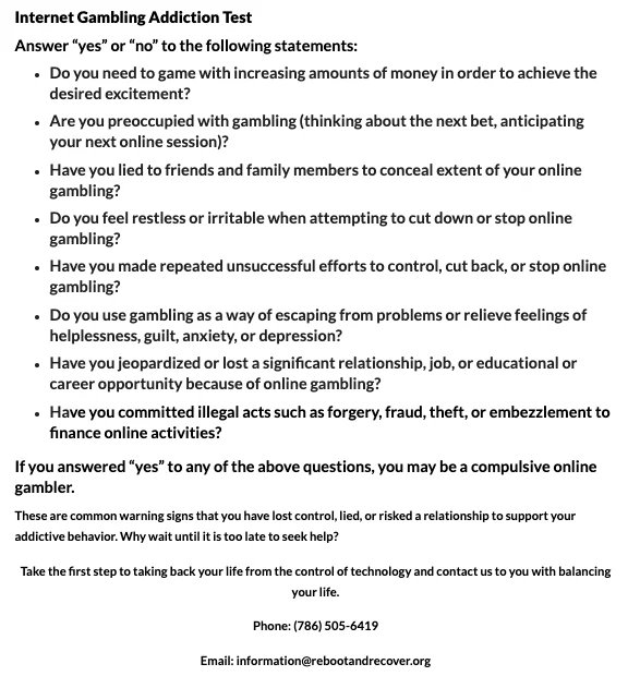
The website includes free Yes/No tests that ask people how screen addiction has affected their lives, and the client’s founder wanted our help with improving them.
BEFORE
Originally, these tests didn't look visually engaging and are not fillable forms that the client can collect/quantify.
AFTER
- I advocated for using Google Forms to make the tests interactive and people's responses can be collected for data review. As per our new style guide, the forms now have more concise and empathetic copy. View a live example here.
Awards
- It’s Nice That
- AIGA
- Fonts In Use
- The Dieline
Contact
- email@domain.com
FROM RESEARCH TO WIREFRAMES
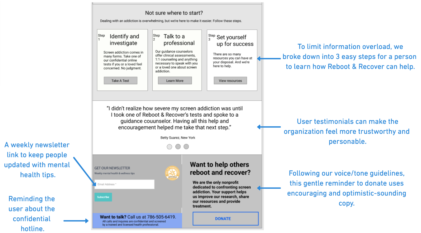
Using card sorting, my team and I aligned on the website homepage's information architecture:
- What Reboot & Recover is/does
- What screen addiction is (and how the pandemic can influence it)
- Encourage public donations
- Resources (including the support hotline and Yes/No tests)
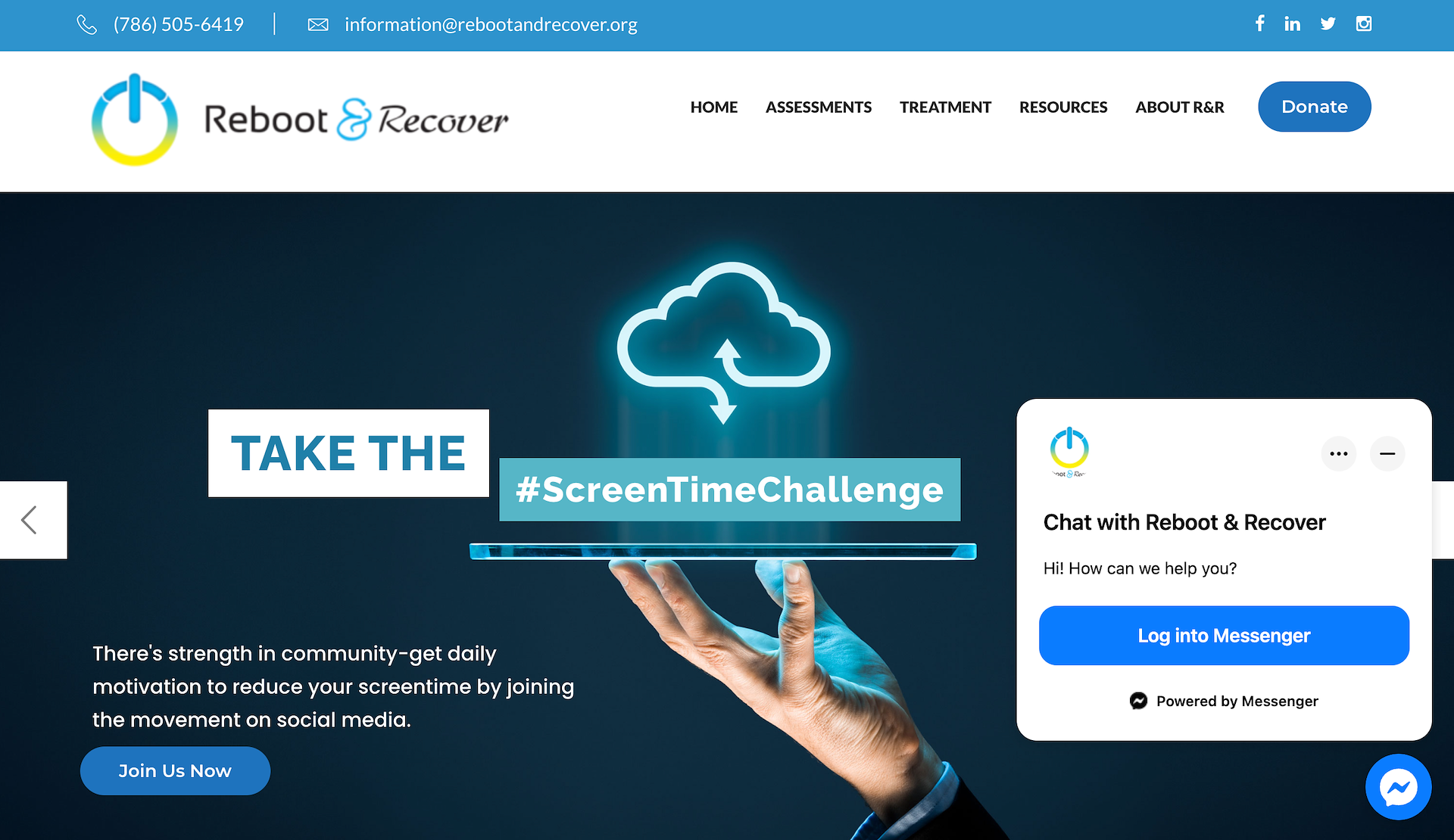
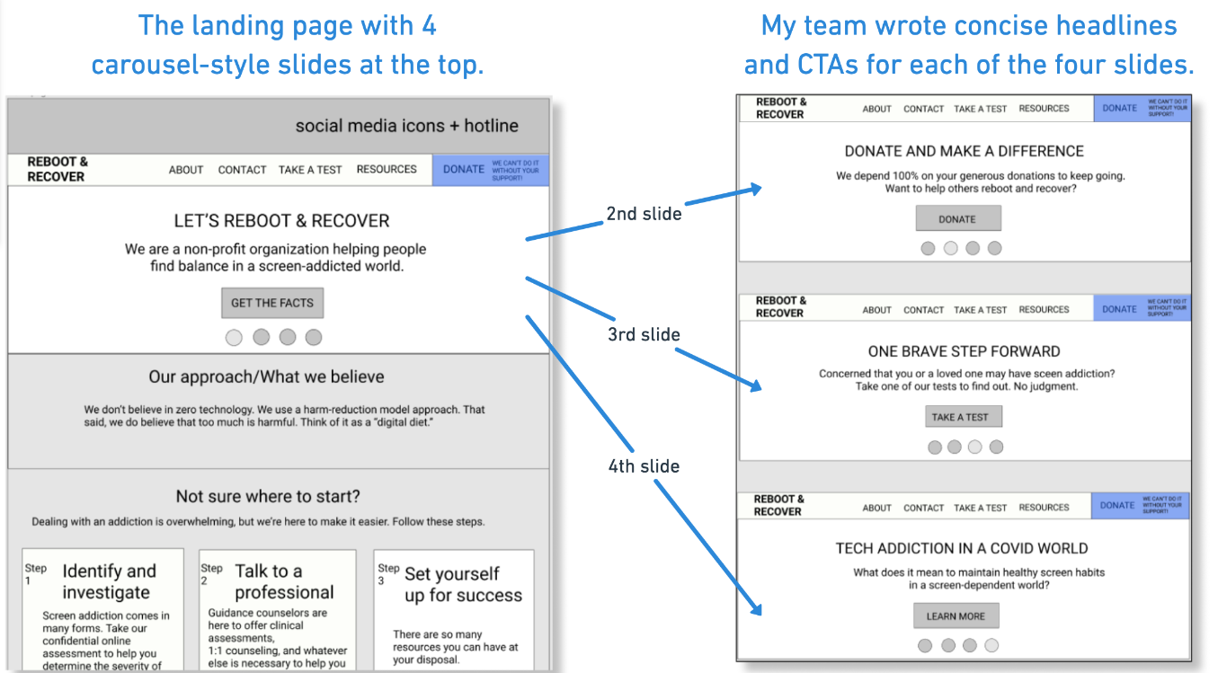
Applying a carousel design above the fold allowed my team to organize and show multiple headlines, resources and CTAs to a reader. We created Figma wireframes for the new landing page and presented to our client:
The result.
Through our UX research and writing work, we overhauled our client’s website with a new empathetic brand voice, a refreshed modern design and renewed information architecture.
REFRESHED AND USER-FRIENDLY
By relaunching our client's website with more concise and empathetic UI copy, visitors can easily reach more resources than before:
- Helpful step-by-step resources
- User testimonials
- The support hotline
- Contributing donations
- A weekly mental health-related newsletter
Our client appreciated how our rewritten UI copy anticipated user needs, are now able to collect Yes/No form submittals and more donations, and saw an increase in calls for their professional support helpline.