— PROJECT NAME
Unfriendly Skies
— ROLE
Using copy decks
Rewrite UX copy
Working with voice/tone
— DATE
Winter 2019
As part of the high-intensity UX Writing Academy course I took with UX Writing Hub, I rewrote four use cases from real-life airline websites.
As dealing with flights can be stressful, airlines and their web copy should consider customers' feelings and not add unnecessary stress on them when booking and flying.
I used copy decks to break down each use case's scenario, content description, content element and rationale. By doing this, I explained how my recommended rewritten UX copy can sound more empathetic and/or helpful to the individual seeing the copy.
USE CASE #1
In this use case, a person gets informed that a flight has been delayed — a not-so-enjoyable update that many people dread.
However, the person is not informed about what caused the delay and does not give the person any options on how to move forward (like possibly requesting live flight updates or calling customer support).
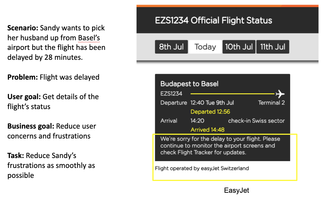
The copy in the yellow rectangle (above, right) gives the person some information about the delay but does not give any impactful next steps.
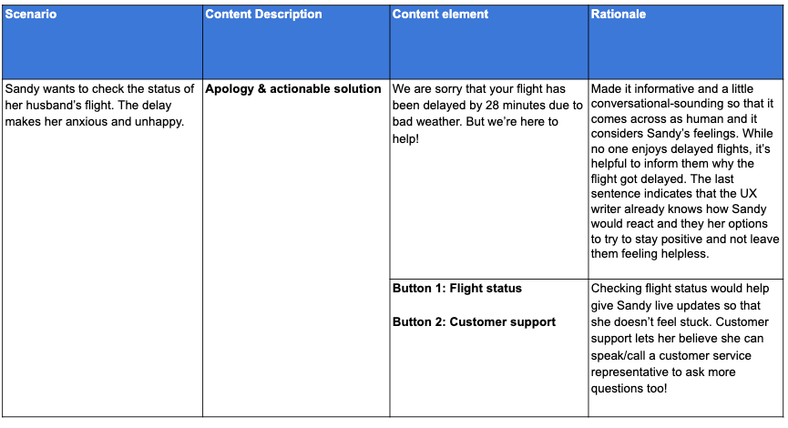
With this copy deck above, I explained how the original copy could be improved with concise and empathetic-sounding copy that use the word “we” to sound more conversational.
I also recommended two new CTAs (“Flight status” and “Customer support”) to give the individual options on what they could do next, instead of feeling lost and not knowing what to do next.
USE CASE #2
In this use case, a customer wants to book a flight and is about to enter an additional payment method to split the cost between two or multiple cards.
However, the easyJet site only allows one payment card (highlighted in a yellow rectangle, below) which may discourage the customer from booking the flight with easyJet.
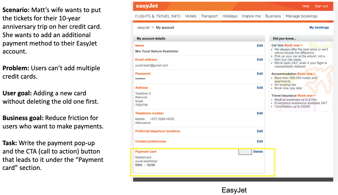
This use case, above, does not provide any copy or CTA about adding a second or multiple cards.
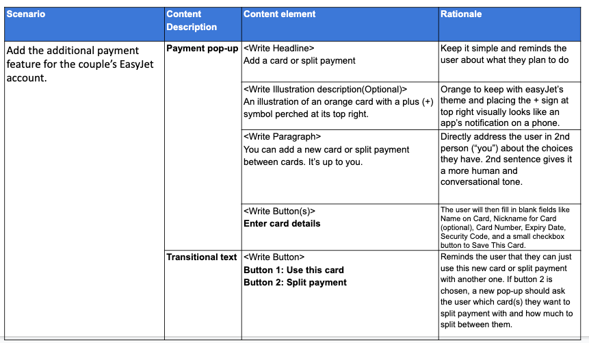
With this copy deck above, I detailed how a payment pop-up’s copy could be written, with a pop-up headline saying, “Add a card or split payment”.
The transitional text are for CTA copy that would show up after the customer enters their first card details (the customer would then decide between clicking “Use this card” or “Split payment”, the latter of which would lead to another pop-up about entering another card’s details).
USE CASE #3
In this use case, a customer wants to book a flight but is unsure when she wants to actually fly out and back. She also came across a great offer that won’t break her wallet but since she’s still uncertain about the dates.
The copy in the yellow rectangle (below, right) gives her an option to keep that offer’s price for now until a later time when she can decide the final dates. However, the copy looks a bit confusing and lengthy, which may cause added unnecessary stress of the customer.
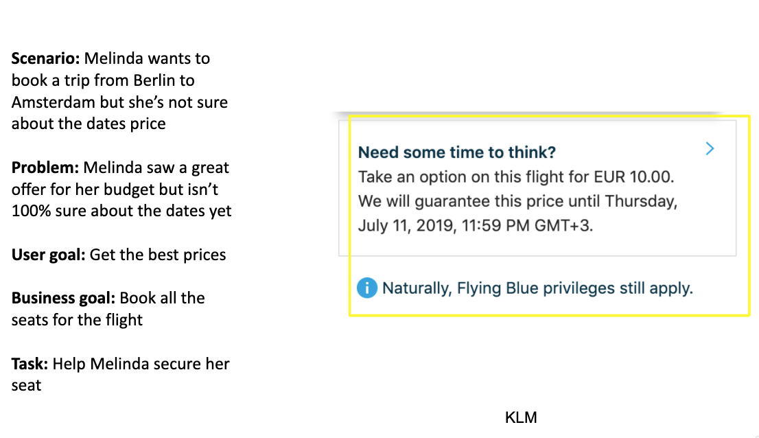
While giving the customer an option to keep the offer’s price for now (highlighted in the yellow rectangle above, right) is a great idea, perhaps more concise copy can help the situation better.
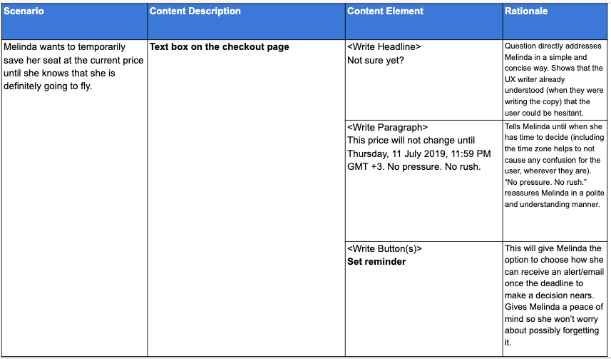
In this copy deck, I simplified the text box with conversational-sounding copy that considers the customer’s feelings (creating the text box headline’s as “Not sure yet?”).
Besides cutting the original lengthy copy down to just the critical details, I added a CTA (“Set reminder”) to assure the customer that they won’t forget this offer and have more time to decide.
USE CASE #4
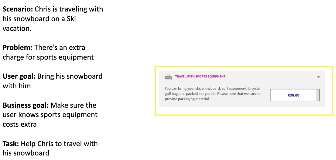
In this use case, a customer wants to fly with special sports equipment but notices that it would cost an extra fee.
The body copy in the text box looks lengthy and the mini-text box that boldly says "£30" makes it sound like it’s an additional burden on the customer to travel with sports equipment. It may even discourage the customer from wanting to fly with the airline in the future.
The airline should not use copy that sound like they’re burdening certain customers with fees who travel with added baggage. While fees seem inevitable, perhaps a nicer tone can ease that.
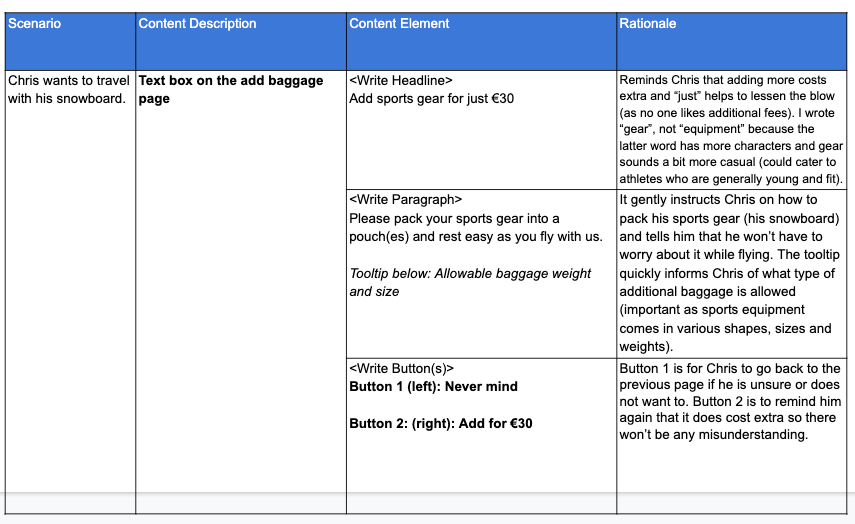
In this copy deck, I simplified the headline to make it sound cheerful and the word “just” subtly informs the customer that it is not necessarily a large fee.
The words “sports gear” also sound more conversational and cuts down on character amounts, as opposed to “sports equipment”.
The paragraph concisely informs the customer what to expect when flying with sports gear. I also included an additional tooltip that informs the customer what types of baggage sizes and weight are allowed.
The two new CTAs gives the customer options and also reminds them of the “light-sounding fee” amount again.
CONCLUSION
This project taught me that cutting copy into essential details is more convenient for flyers, who likely are stressed and pressed on time and budget. Also, I’ve learned the importance of writing empathetic-sounding copy and providing a user options (like with helpful CTAs and tooltips).
When writing copy for specific industries and companies (in this case, airliners), it’s imperative to consider users' feelings in situations beyond their control (like their flight getting delayed).